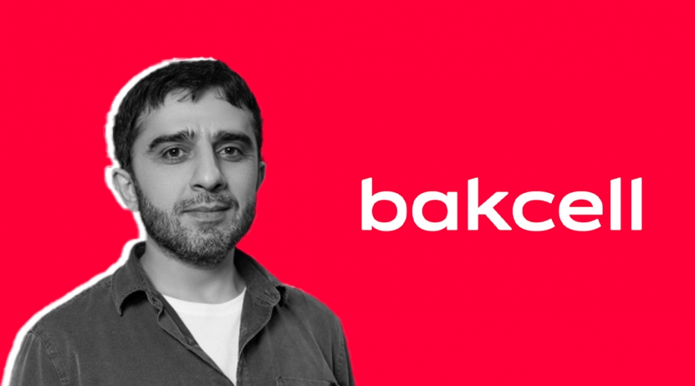
Bakcell, one of the largest technology companies in Azerbaijan, has rebranded. Bakcell tried to show that it is more innovative with this rebranding.
Design expert Rizvan Bagirli wrote his thoughts about rebranding.
When opening and commenting on student work, I have one guiding principle: first impressions. If my first impression of the design from a distance is positive, then the work is successful. Of course, when you zoom in and refine the details, the flaws will be revealed. But as a rule, fixing them is not so difficult.
A few days ago, I got acquainted with the new visual identity of Bakcell, which was presented to everyone yesterday. When the Bakcell team introduced me to the new branding, I had to interrupt them on the very first slide and reminded them of my above principle. From the first slide, my impressions about the new corporate identity were positive. I would like to mention in this article some of my professional ideas that I shared with the authors during the presentation.
Typographic logo.
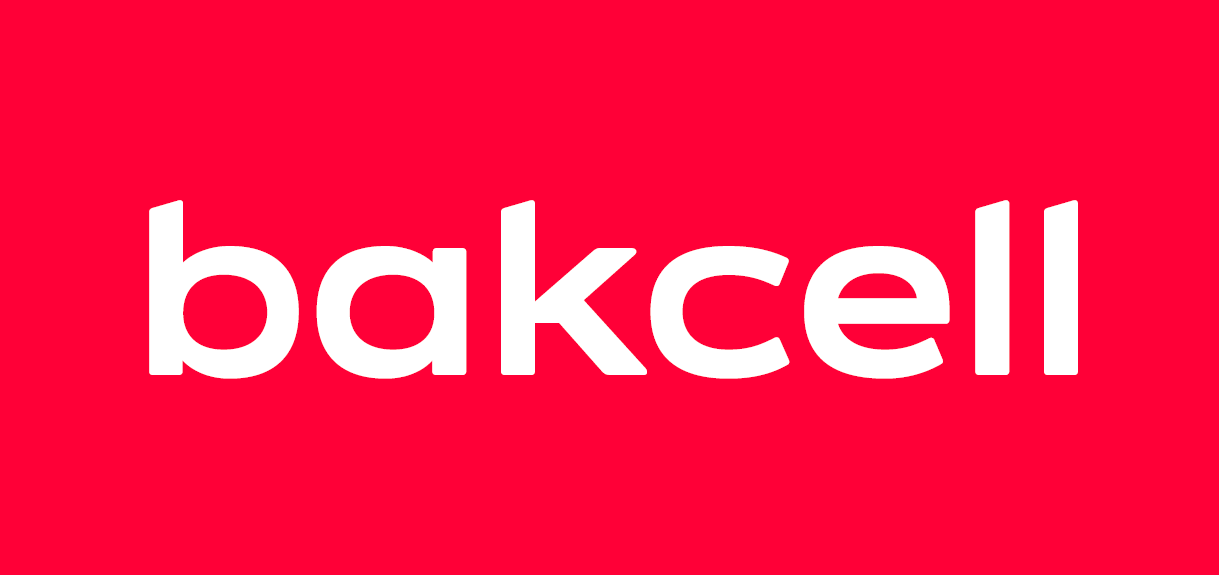
When rebranding well-known brands, the target audience is often logos. Some will claim that it is plagiarism, some will stick to the previous logo and not like the new version, or they will argue that the logo is technically simplistic and wasted money. Typographic logos insure themselves in this respect. The graphic form of the text is already unique, different, it is inappropriate to look for a similar one. Although the star of the previous logo is gone as a symbol, the corporate style is still based on the star. The overall corporate style uses the star dynamically, resulting in a modern, dynamic identity. In short, the previous star concept has been further developed and modernized.
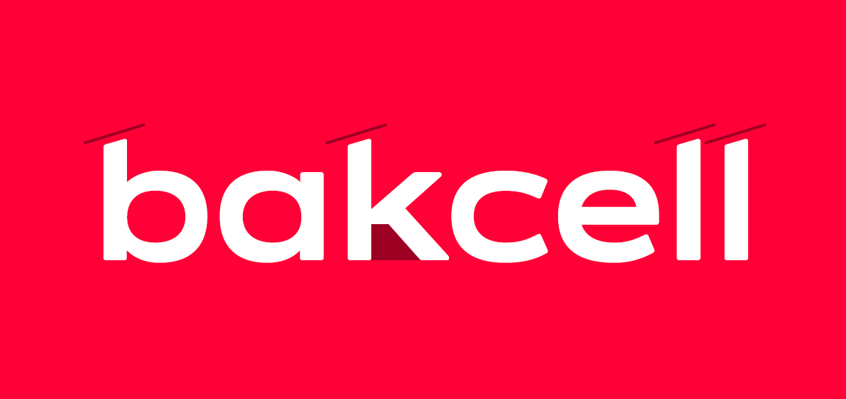
When preparing typographic parts of logos in my articles, I recommend not to finish the work by selecting the necessary font, writing the text, and kerning (adjusting the spaces between characters). Adding conceptual touches to the text section reinforces the uniqueness of the logo. In the new logo, by designing the ends of the letters b, k, l at a certain angle instead of parallel, they have preserved the general corporate style (rectangles given in perspective) here as well, which was one of the details that caught my attention first. It is also interesting that the center of the letter k is cut parallel to the ground to form a tilted rectangle in perspective in the lower negative space. If this is a deliberate touch by the designers, one can't help but applaud them.
"Star system" in corporate style.
As I already mentioned, the star of the previous logo has disappeared at first glance. But when we see that the corporate style is built entirely on the basis of a dynamic star structure, we understand that the decision is right. Against the background of so many dynamics, the typographic logo slightly "calms" the overall image, creates balance in the design.
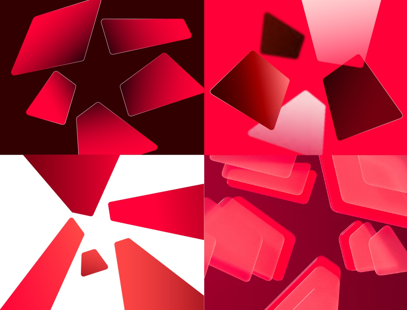
Offering 3d, gradient, outline and plain color graphic shapes forming a star in a corporate style will increase image variety. But I think that after some time, Bakcell players will prefer simple monochrome uniforms to avoid image pollution.
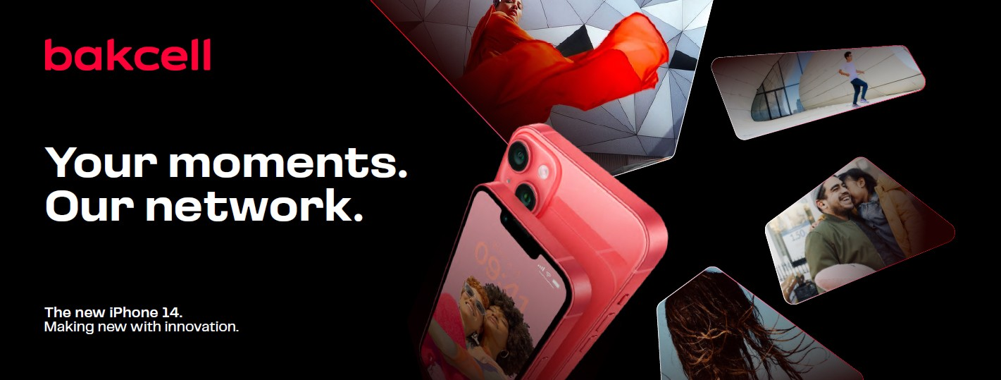
I've also seen these rectangular shapes sometimes used as containers for images in the presentation. Finding photos that match this perspective won't be easy when creating a visual. Even if it is found, the details of the photo will not be visible inside the small dynamic shaped container, the image strength will be reduced.
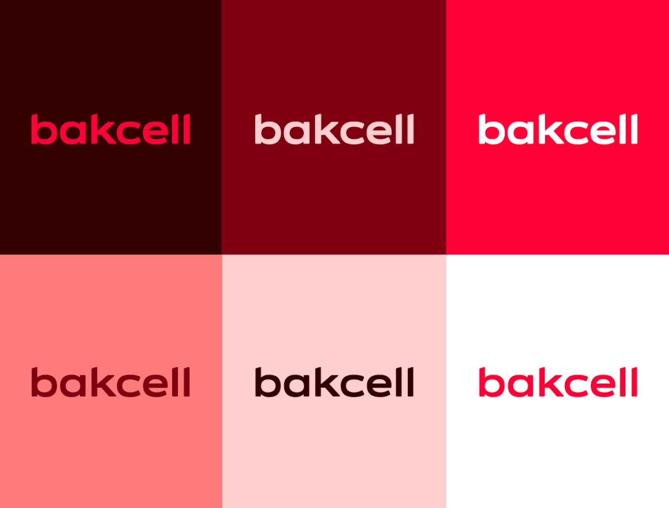
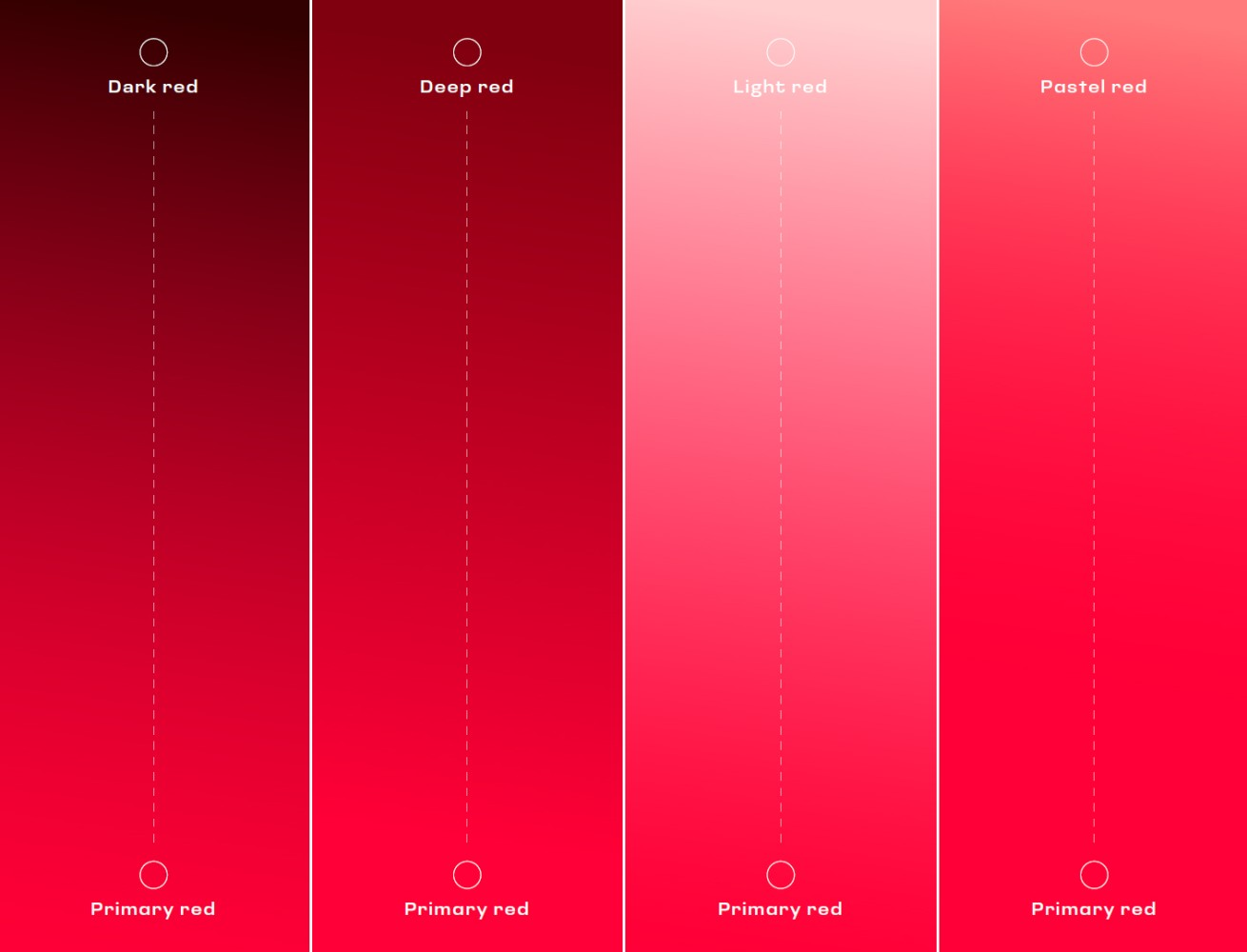
Color.
"Bakcell red" has been preserved with a very slight touch. The previous C0 M100 Y80 K0 red color composition has been replaced by C0 M95 Y75 K0. This will not make a noticeable difference. Very light shades of red were also used in the color palette, which I did not recommend their active use. Especially in printed materials, the work will look faded, as if it was poorly produced. I can say the same thing about gradients. Gradient transitions of the main color to a darkened version look better. Bakcell red is very light, and the transition to red close to white will make the work look pale.
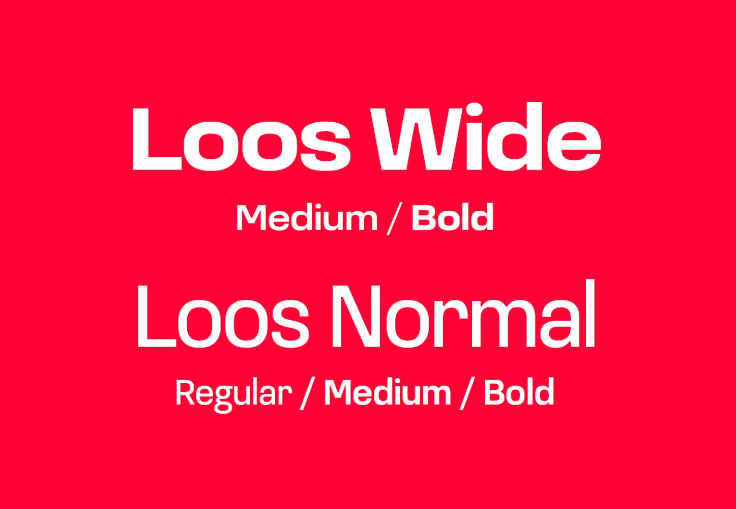
Typography.
Wide and normal versions of the Loos font were used in the corporate style. As the first one is a display font, it is intended for headings, and the other one is intended for use in mass text. Here, the designers of Bakcell and its advertising agencies will need serious typographical skills. I don't think there will be any problems with the titles. But for mass text, the font can cause certain headaches. Let me explain why.
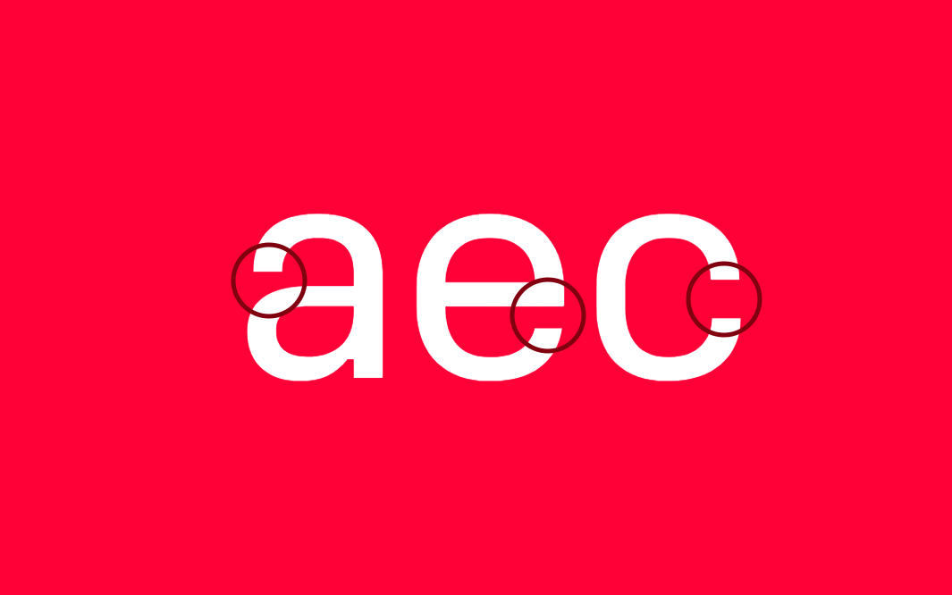
This font refers to closed grotesques. That is, if we look at the letters a, e, c, we will see that the ends of the letters bend and almost touch the stem. The readability of the text in small sizes may be reduced due to the small amount of space left in between. At the same time, it is also possible that the massive text drawn up with such fonts will create a slightly thick, dirty impression. To compensate for them, you should not give less spaces between lines. Although I am not a fan, it may even be necessary to resort to spaces between characters.
About 3-4 years of my career is related to the Bakcell brand. As an art director at the McCann advertising agency, I was directly involved in the development of advertising visuals for this brand. There were moments when I didn't want to see the red color and the Priva Pro font