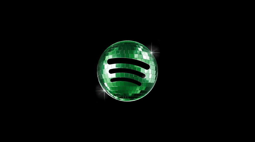
Spotify has revealed that its new app logo in the shape of a green disco ball, which has caused controversy among users, is temporary. The company said that the change is part of the platform’s “Spotify 20: Your Party of the Year(s)” campaign launched to celebrate its 20th anniversary, and that the classic green logo will be back in the coming days.
The new icon began appearing on iPhone and Android devices this week. Instead of the traditional green circle and black sound waves, users were greeted with a bright green disco ball design.
The change was met with mixed reactions on social media. Some users on X and Reddit called the new logo outdated, distracting, and out of place on the phone’s screen design. Some users even said that the icon reminded them that the app was stuck in the loading process.
In response to concerns, the company confirmed that the new design is not permanent and that the standard logo will return this week.
As part of its anniversary campaign, Spotify also introduced nostalgic features that allow users to revisit the song they first listened to, their overall listening history, and their most-listened-to music.